Story
WormOS
Last updated 2 years ago
I like to spend time in different rooms of my house. I have a place I sit to work, and another where I lounge to read. Changing contexts like this makes it easier to differentiate between activities and not get distracted. If everything you do then all your possibility spaces get intertwined in one large tangle of a mess—unfortunately this is the way software has always been.
Since a friend told me about WormOS last year I have absolutely fallen in love with it. It lets you separate your different activities out into different rooms. No longer do you have all your apps open over each other, but instead grouped into these spaces with components that you commonly use together.
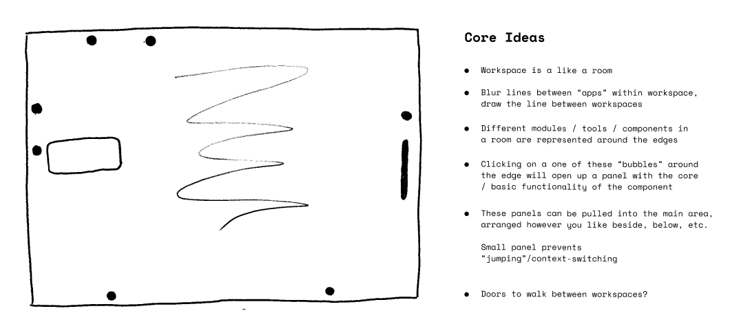
And they really do feel like rooms! Everything is right there for you to see. All the “areas” or components of the space float around the edges to always give a sense of presence. And you can turn your attention to each slowly—not like a fast head-jerk or teleportation, but more like getting up and walking across the space haha. I mean, for example, right now I’m in my “writing room” as I write this story. Mostly, I am focused in the middle where I am writing this text, but on the left edge of my screen I have my music player—which is automatically queued up with songs I like to listen to while writing, and in the right corner there’s a browser icon that I can reach to if I need to do some research.
I also have various components scattered around for characters, notes, or world-building (I’m a novelist). If I click on any of these bubbles it doesn’t open a new window like would normally happen on Windows or MacOS , instead it morphs into a small floating panel. So if I click on the browser it gives me a little search bar to type into, or if I click on my music it gives some basic controls and info about the song currently playing without jumping out of the context of my writing. If I want a more detailed view for any of these I will just drag the panel and let it fill up a quarter, or one side of my screen/space. If I drag my character builder and browser into the space (side-by-side) then my writing area will float back to its slot on the top of the screen, ready to be pulled back in when I need it again.
Why do you have these bubbles all over the edges of your screen you might ask. Some people comment that it looks rather messy this way but I like it because I have a spatial understanding of where each component is placed. I know to grab to the right if I want a browser, or to the left if I want music.
Oh and for all you people who have 50+ tabs open, there are no tabs in this system—at all! It was difficult to get used to at first but it’s so so much better than before. Though you can save pages to be their own bubbles on the side of the screen—which is similar to tabs but more intentional, like temporary bookmarks for pages related to your current work. But you can also take the page (or anything really) and throw it to a collection, project, or even another workspace. You can even throw pages to a friend’s exposed spaces and they’ll be able to pull it up. Honestly it’s super useful for grocery lists—I’ll start up a little note in the corner and then “throw” it to my husband’s phone to share the list with him if he’s going out shopping.
Anyway, needless to say, I am very happy with this new system and workflow. It’s the first time I’ve felt fully in-control with my own technology, such a liberating feeling!