City Fragments
Quick thoughts on designing better spaces
Last updated 3 years ago
#4: Cities are not alive
Cities are not alive, it is the people that make them feel alive. A town without people is a ghost town, and a city without people is a ghost city.
The prevalent metaphor of CITY AS ORGANISM has been
around for hundreds, if not thousands of years in some form or
anotherA metaphor is, in a sense, a two-way bridge. We often
think of the city as an organism because we can better wrap our minds
around biology than the functioning and structure of our own cities.
However in the time of ancient Greece, the metaphor went the other way.
Plato spoke of human body as a city, of the human mind as a regime; at
the time this was the natural direction of the metaphor as they knew
much more about the functioning of the city than of human biology.
. However this metaphor falsely perceives the
city as being alive and fails to recognize that it’s the
people that make a city feel alive.
Originally I had high hopes for the CITY AS ORGANISM
metaphor. I imagined that it conveys well the complexity and
interconnectedness of the systems of a city. However quickly I
learned that architects took a more literal approach, taking inspiration
from the form, repetition, and separation of functions in the body—which
led to designing spaces and visions that felt, paradoxically, much less
alive.
#3.1: Transition spaces
There is, in fact, an idea of “transition space” in architecture,
which is defined “as a link or a connection between two (or more)
enclosed spaces”Szauter, D. (2018). Transition Spaces. Műszaki
Tudományos Közlemények, 9(1), 223–226. https://doi.org/10.33894/mtk-2018.09.51
Transition spaces help to connect or even blur the boundaries between spaces, for example a covered porch that helps blur the line between indoor and out. I feel, however, that transition spaces are only one piece of the puzzle in my own conception of “transitions” within cities.
Some thoughts:
- Transitions take place at many scales (entering a room, neighbourhood, city, country)
- Transitions be as much between social spaces as physical spaces
- Transitions not as connections of space but as passages between frames of mind
- Long transitions craft a more powerful experience: a journey
- Cinema has developed many different types of transitions: what are different types of transitions of physical space?
#3: Transitions
Saying thank you as you step off the bus, walking from one place to another, the great gates that often mark the entrance to a chinatown, a revolving door, transitions are everywhere in the city. It is natural for us to have transitions between different kinds of spaces. This is also one aspect which digital space tends to lack: if you click a button to leave a Zoom call for example you get a jarringly instant cut from being “in” the meeting to being “out” of the meeting. This sort of immediate cut should ideally be avoided, and in particular it would be difficult/impossible for physical space to immediately switch from one state to another—which would be akin to teleportation.
from the parking lot, you approach the Magic Kingdom via the Monorail. These specialized methods of arriving at the gates convey the sense that you are transitioning from the mundane world, and prepare you for a special experience
Curry Chandler writes above about entering Disneyland, and the transition away from the mundane world into a special one. I think perhaps this helps to highlight the importance of designing and thinking about transitions in urban space.
And just like film transitions have evolved over the years, and new vocabulary has been formed, I still don’t have the right vocabulary—or even mental models—for how to think about or explore urban transitions… there is certainly still much to be discovered!
#2: Bottom-up design
Often cities are often planned top-down. Laying out streets, then buildings, then floor layouts, then interiors, etc. Designing anything from the top-down creates assumptions of all the lower levels. I haven’t figured out the right way to frame this idea just yet, but top-down is like being focused on your destination, whereas bottom-up is like being focused on your journey without assuming you know where you’ll end up…
I’ve been trying to explore different methods of designing from the bottom-up instead of top-down. Bottom-up design starts at the human scale and works up from there. Some examples of bottom-up design:
- Writing short design-fictions: If you’re designing something as large as a city, or even simply a piece of software, writing a story can help force yourself to think from a human-scale through someone’s perspective
- Idea collages: Instead of laying out the streets or buildings of a city, make a collage or mood board of all the kinds of places or activities you’d like to see around you. Kids playing in the park, open workshops, signboards with community activities, etc.
- Quick idea journal: Exactly what I’m doing now! Originally inspired by Keita’s Quick Ideas, write up quick design thoughts and ideas (try to keep them short and succinct if possible) and give each one a number as you go to be able to reference back to past thoughts. By the time I’ve amassed a sufficient number of ideas (I’d say somewhere around 40 - 90, but it may vary) I start to feel like I can see the bigger picture- that somehow all the little ideas are like puzzle pieces of something larger.
- Copy + Paste + Edit: When designing in Figma I have a habit of copy-pasting the entire artboard every time I want to make even the smallest change. My first artboards are always ugly as hell but through iteratively making small changes over time it turns into something fantastic!
Reflecting on these different techniques, some patterns / key ideas:
- Think on a human-scale: storytelling, collaging, small quick ideas
- High quantity of small iterations: quick ideas, iterative design, enough small ideas over time lead to a better overall bigger picture
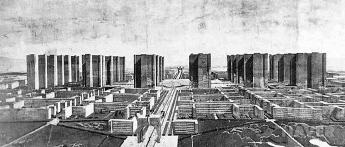
#1: No Floor Space Ratio
Recently I spent 12 hours listening to a city council meeting on the “Future of South False Creek.” Where our city’s real-estate department (not planning department) was their fantastic plan to bulldoze the whole community where I grew up in order to build skyscrapers.
Something that has agitated me throughout the presentation and discussions was this “FSR” metric which is obtained by dividing the total floor space by the space of the lot. This does not include parks or streets but it does include the shared and communal spaces inside of our co-ops. It feels to me like FSR serves to maximize building density without respect to community density.
I went delving into the history of South False Creek and found the original development plan, which to my great surprise clearly stated:
No Floor Space Ratio - The criteria set forth in the Official Development Plan shall be used for density and bulk controls instead of traditional floor space ratios.
Instead they lay out qualitative criterias rather than rather than quantitative ones. In other words: how the space should feel, not what the numbers should be.
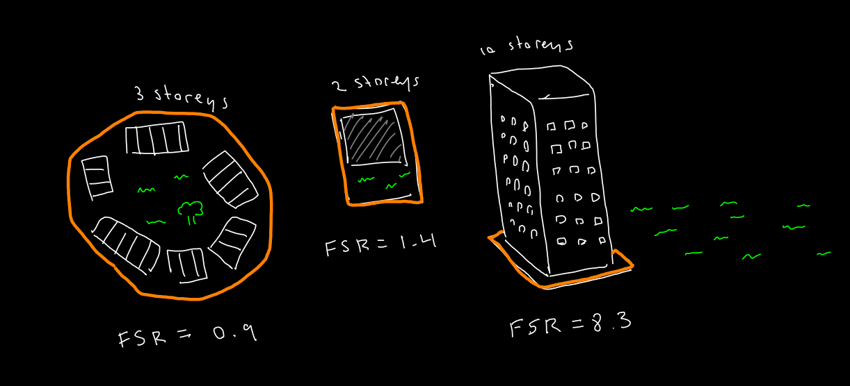
This is my artistic rendition, the exact numbers are made up but it’s close enough to being accurate to illustrate the point. From left to right: mid-density community of town-houses surrounding central courtyard, a low-density single-family home, and finally a condominium tower with a public park beside it. Because the shared space (park) of the tower is a public park it does not get counted as part of the FSR rating and thus leads to a much much higher floor space ratio.